
Did you know that the human brain reacts almost immediately to color even if it is not a conscious awareness? While color and vision in general is perceived in the primary visual cortex of the occipital lobe of the brain, it reacts emotionally to it through the limbic system.
 Knowing about color and what it means, both to you as a massage therapist and to others who may be your clients, is important in conveying who you are and what your work is all about.
Massage therapy is about healing, about relaxing and is an extension of your personality. Of course you will want your office and massage room to indicate a separation from the outside world while reflecting your professionalism, yet be a comfortable space. Of course it is important to have calming and comfortable decor, but have you ever thought about the color of your massage products and linens and what the colors mean?
The Meaning of Colors
Colors represent different things to different people depending on past experiences and cultural reference. However, there are some common responses to color that researchers have found to be universal:
- Red– Red is a very intense, emotional color. It stimulates the heartbeat and promotes faster breathing. This might not be so good if you have clients with high blood pressure or anxiety issues. In a therapeutic setting it should only be used as an accent color.
- Orange – Orange is one of the least popular of all colors. A combination of red and yellow, it has similar properties of both and is not common in a therapeutic setting.
- Yellow – Even though yellow is generally considered a cheerful color, it is ne that seems to cause many people to lose their temper. Babies cry more in yellow rooms and can be unsettling to adults. It speeds metabolism and can increase focus and concentration.
 Green – To most people, green symbolizes nature. Green calms and refreshes, though it will depend on the shade of green used. It is a result of combining blue and yellow and represents the best of both colors. Green is also associated with healing and balance. Pale greens are popular in hospital settings and waiting rooms.
- Blue – Blue is the color of a clear sky and calm waters. Blue causes the body to engage the parasympathetic system and relax. Most people pick some shade of blue as their favorite color, and it is one of the most popular wall colors in all types of settings.
- Purple – Deep purple is seen as the color of royalty and to some it represents luxury and wealth. Too much purple can be overwhelming so it should be used sparingly. Light purple, such as lilac, can be used on a wall, but it needs to be balanced through the use of other colors.
- Brown – Brown is the ultimate earthy color. It can be used in pastel tones, such as beige and ecru on walls, or as accents in darker colors. If not used as a paint or fabric color, various shades of brown can be seen in the use of wooden furniture or accessories.
All colors have different shades and hues. Pale colors will open up a room; darker colors can bring the eye to a specific place in the room.
Consider the mix of colors to be used as well. Do you want a monochrome palette, one that includes various tints and shades of one color? Or, would you prefer an analogous color scheme, including colors that are adjacent to each other on a color wheel, such as green with touches of blue and yellow? Using complementary colors can bring pop to a room and consist of colors on opposite sides of the color wheel. The walls and carpeting color may be variations on blue with shades of orange or peach in artwork or pillows as accents.
Are Some Colors Better Than Others?
 Because color and color themes should reflect who you are there is no one best choice. What you should do is pick a color that you feel comfortable with and stick to it. Use it for your office space, your uniform or work clothing, your website as well as brochures and business cards.
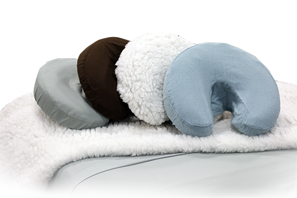
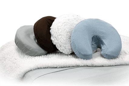
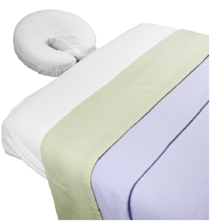
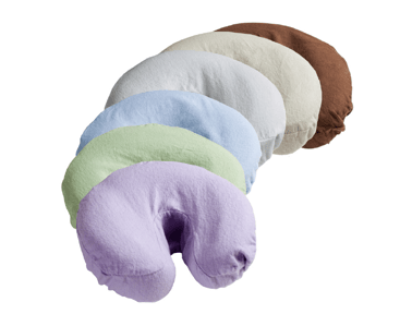
Even if you prefer bright or bold colors, keep in mind what is best for your clients. You can decorate your office in the paler version and reserve the more intense color for your uniform or in decorating accents. Medical scrubs come in a huge variety of colors, designs and themes that can match just about any office scheme. Picking sheets and towels for the massage room to complement the overall color scheme makes it easy to mix and match sets.
Neutral color walls and flooring can be enhanced through colorful paintings, wall hangings, pillows or other accessories. When you feel like a change, simply change the accent color. For example, a pale sage green wall can be accented by shades of reds, blues, yellows or browns – each bringing a different feeling to the room.
Whether you have a specific theme in your office, such as one inspired by Eastern culture, nature or your locality – or one with no specific design – pulling it together with color is one of the easiest ways to make it cohesive and look professional.

This blog was curated from an article written by Linda Fehrs LMT and was originally published on integrativehealthcare.org and can be found here.
Resources:
Cherry, Kendra. “Color Psychology: How Colors Impact Moods, Feelings and Behaviors.” About.com. The New York Times Company, n.d. Web. 26 Aug 2010. http://psychology.about.com/od/sensationandperception/a/colorpsych.htm.
Salla, Prerna. “The power of colors and their meanings.” Buzzle.com, 13 Jan 2005. Web. 26 Aug 2010. http://www.buzzle.com/editorials/1-13-2005-64166.asp.
Wikipedia. “Color.” Wikipedia. Wikimedia Foundation, Inc, 26 Aug 2010. Web. 26 Aug 2010. http://en.wikipedia.org/wiki/Color.
